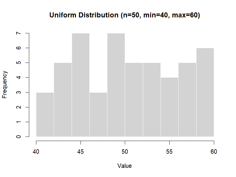
Figure 3.1 – Uniform distribution (example with n=50).
Monte Carlo simulations rely on probability distributions to model uncertainty.
💡 What do we mean by uncertainty?
In GMP and pharmaceutical work, uncertainty means we cannot predict exactly what value will occur —
only the range and likelihood of possible values.Examples:
- The assay of an API: usually near 98%, but with natural lab variability.
- The weight of a tablet: centered at 100 mg, but not every tablet weighs exactly 100 mg.
- The time to equipment failure: unpredictable, but often follows a statistical pattern.
Probability distributions are the tools we use to describe and simulate this uncertainty.
In this chapter, we review four common distributions used in GMP & Pharma applications, with visual examples.
a = minimum, b = maximum.set.seed(123)
runif(50, min = 40, max = 60) # 50 values between 40 and 60
Figure 3.1 – Uniform distribution (example with n=50).
Parameters: μ = mean, σ = standard deviation.
set.seed(123)
rnorm(50, mean = 0, sd = 1)  # 50 values from the standard Normal distribution (mean=0, sd=1)
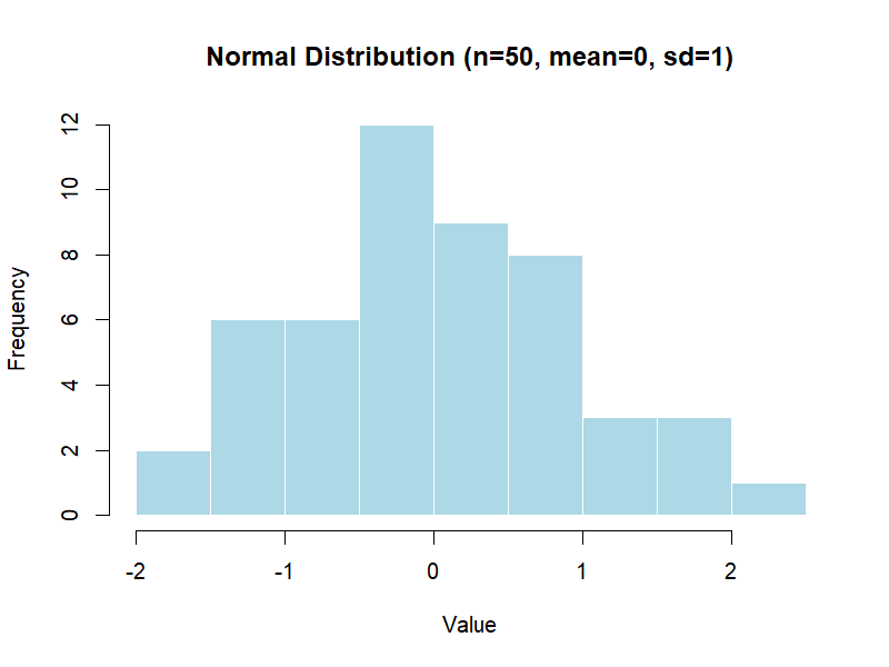
Figure 3.2 – Normal distribution (example with n=50).
Parameter: λ = rate (events per time unit).
set.seed(123)
rexp(50, rate = 1)  # 50 exponential values with λ = 1
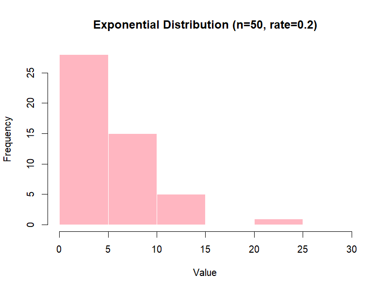
Figure 3.3 – Exponential distribution (example with n=50).
Definition: Defined by a minimum (a), a maximum (b), and a most likely value (c).
triangle package):
library(triangle)  # make sure the package is installed
set.seed(123)
rtriangle(50, a = 0, b = 3, c = 1)
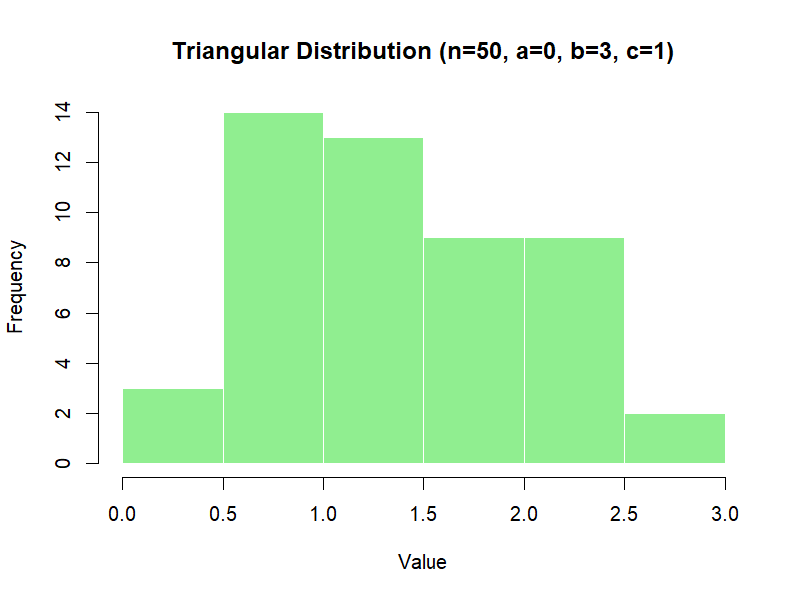
Figure 3.4 – Triangular distribution (example with n=50).
| Distribution | When to Use | Example in Pharma |
|---|---|---|
| Uniform | All values in a range equally likely | Early risk assessment with no prior data |
| Normal | Natural variation around a mean | Assay results, tablet weights |
| Exponential | Time between rare events | Time to microbial contamination, pump failure |
| Triangular | Only minimum, most likely, and maximum are known | Expert estimates for stability loss |
🔎 Note: In the small-sample examples (n = 50), distributions may look irregular due to random variation.
With larger samples (see illustrative examples, n = 1000), the histograms converge toward the smooth theoretical shapes.
This reflects a key principle of Monte Carlo simulation: results depend on the number of random draws.
Instead of looking at just 50 numbers, we can simulate 1,000 values and visualize them.
set.seed(123)
x <- rnorm(1000, mean = 100, sd = 5)

hist(x,
     main = "Normal Distribution (mean = 100, sd = 5)",
     xlab = "Value",
     col = "lightblue",
     border = "white")
The histogram shows the classic bell-shaped curve, centered at 100 with most values within ±10.

Figure 3.5 – Histogram of 1,000 simulated values from a Normal distribution (mean=100, sd=5)
library(triangle)
set.seed(123)
y <- rtriangle(1000, a = 95, b = 105, c = 100)

hist(y,
     main = "Triangular Distribution (a=95, b=105, c=100)",
     xlab = "Value",
     col = "lightgreen",
     border = "white")
The histogram shows a triangle shape, rising towards the most likely value (100) and falling off towards the extremes.
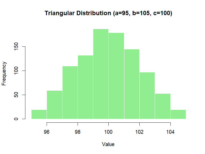
Figure 3.6 – Histogram of 1,000 simulated values from a Triangular distribution (a=95, b=105, c=100)
Choosing the right distribution ensures that simulated data reflect real-world processes.
Using the wrong one can lead to misleading conclusions, especially in risk assessment and capability analysis.
👉 In the next chapter, we will see how distributions combine through the transfer equation to model variability propagation in real processes.
| ← Previous: Random Numbers vs. Random Variates | ▲ back to top | Next → The Transfer Equation |